The best color tone for a website depends a lot on:
-
Your brand identity (who you are, what you stand for)
-
Your target audience (age, preferences, culture)
-
The purpose of the site (e.g., e-commerce, portfolio, corporate, education)
General guidelines for choosing color tones:
-
Neutral / Soft Tones (e.g., whites, grays, soft blues)
-
Clean, modern, minimalistic
-
Good for corporate, tech, portfolios, education
-
Easy on the eyes and highly readable
-
-
Bold / Vibrant Tones (e.g., bright blues, reds, oranges)
-
Eye-catching, energetic, dynamic
-
Good for entertainment, startups, food, fashion
-
Use sparingly as accents to avoid fatigue
-
-
Earthy / Warm Tones (e.g., browns, warm yellows, olive greens)
-
Friendly, trustworthy, natural
-
Great for environment, health, artisan, community sites
-
-
Dark Themes / Deep Colors
-
Stylish, sleek, modern feel
-
Popular for creative agencies, portfolios, luxury brands
-
Make sure contrast is high for readability
-
Color Psychology basics:
-
Blue: Trust, calm, professionalism (widely used in finance, tech)
-
Green: Growth, health, nature
-
Red: Urgency, passion, excitement
-
Yellow: Optimism, friendliness
-
Orange: Creativity, enthusiasm
-
Purple: Luxury, creativity, wisdom
-
Black/Gray: Sophistication, neutrality
Bonus: Accessibility & UX
-
Use high contrast between text and background for readability.
-
Avoid overly saturated colors for large backgrounds to reduce eye strain.
-
Use accent colors to guide users (buttons, links, highlights).
Summary
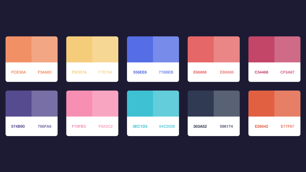
Best practice: Pick a primary color that fits your brand + 1–2 secondary/accent colors + neutrals (white, gray, black) for balance. Test how these look together and keep consistency.


